
What to Put on Your Contact Page
You've been doing your research, trying to figure out what to put on your contact page. You've looked at a handful of websites from people in your niche, trying to get a feel for how they've set things up. And you've noticed something confusing: one person has a "Book a Call" button that takes you straight to a Calendly link. Another has a contact form with ten questions on it. Someone else just has an email address sitting there. You're not sure which approach is right, whether there's a standard, or whether it actually matters that much.
It does matter. And there's a reason the answer looks different on every site you've visited: the right setup genuinely depends on your business and your clients. This post will help you figure out which one makes sense for yours.
What a contact page is actually for
By the time someone lands on your contact page, they're not casually browsing. They've already seen your services page. They have a sense of what you do and who you work with. They're not deciding whether you're interesting — they're deciding whether to reach out.
That's a different kind of visitor to the one reading your about page or scrolling through your homepage out of curiosity. Someone on your contact page is already interested. They just need the page to make the next step feel easy, not complicated.
This is why the contact page deserves more thought than most people give it. It's not a placeholder. It's the last thing someone sees before they decide to get in touch...or don't.
Contact form or booking link: how to decide
This is the question most people don't think to ask, and it's worth thinking through properly before you set up your page.
A direct booking link, something like Calendly or Acuity that lets someone pick a time and schedule straight away, works well when the next step is genuinely low-commitment and clearly defined. A free 20-minute discovery call that someone can book with no financial obligation can work this way.
For some businesses, the direct booking link works really well. A client I worked with who offered psychic readings saw a significant uptick in bookings once she switched to a direct calendar. Her clients could see her availability and book immediately, without needing to go back and forth. For a service like that, where someone has usually already decided they want to book before they even land on the site, removing the extra step made complete sense.
But for most solo service providers offering mid-to-high ticket packages, a contact form tends to work better. Here's why.
A form is a lower-commitment first step for your potential client. They're not committing to a time in your calendar before they've even spoken to you. They're just starting a conversation. For services that are relationship-based or higher consideration, where someone needs to feel comfortable before they're ready to get on a call, that lower barrier often converts better. I've seen this play out with service businesses where an SEO consultant found that switching from a booking link to a contact form actually increased enquiries, because clients felt like they were reaching out rather than committing.
There's also a practical reason a form works in your favour: it lets you vet leads before you invest time in a discovery call. Once someone submits their details, you can follow up, ask a few qualifying questions, and decide whether it's worth getting on a call — rather than realizing five minutes in that they're not the right fit.
The question to ask is: what does my client need to feel ready to take this step? If they need to feel heard first, a form is usually the right call. If the appointment itself is the low-commitment step, a booking link can work.
What should a contact page include?
Regardless of which approach you choose, a few things need to be there.
A brief intro before the form
Not a long explanation, just one or two sentences that acknowledge why they're there and make them feel like they've come to the right place. Something that says "yes, this is where you get in touch about working together" rather than dropping them straight onto a form with no context.
Clear information about what happens after they submit
This is the part most contact pages skip entirely. Will they receive a reply within 48 hours? Will they be sent a questionnaire? Will they be invited to book a discovery call? Spell it out. Someone who submits a form and has no idea what happens next is much more likely to follow up with a competitor in the meantime. Not because they weren't interested, but because they didn't know what to expect next.
The form itself: keep it short
Name, email, and a brief note about what they're looking for is genuinely enough for a first contact. The goal at this stage is simply to get their details and open the conversation. If you need more qualifying information before a discovery call, send a separate questionnaire after they've made initial contact, not before. The longer the form, the lower the chance someone fills it out. Keep the barrier to entry as low as possible, and gather the details you need once you've already got their contact.
One practical addition worth considering: a spam filter. A simple CAPTCHA on the form means the enquiries coming through are from real people, not bots. A small thing worth doing.
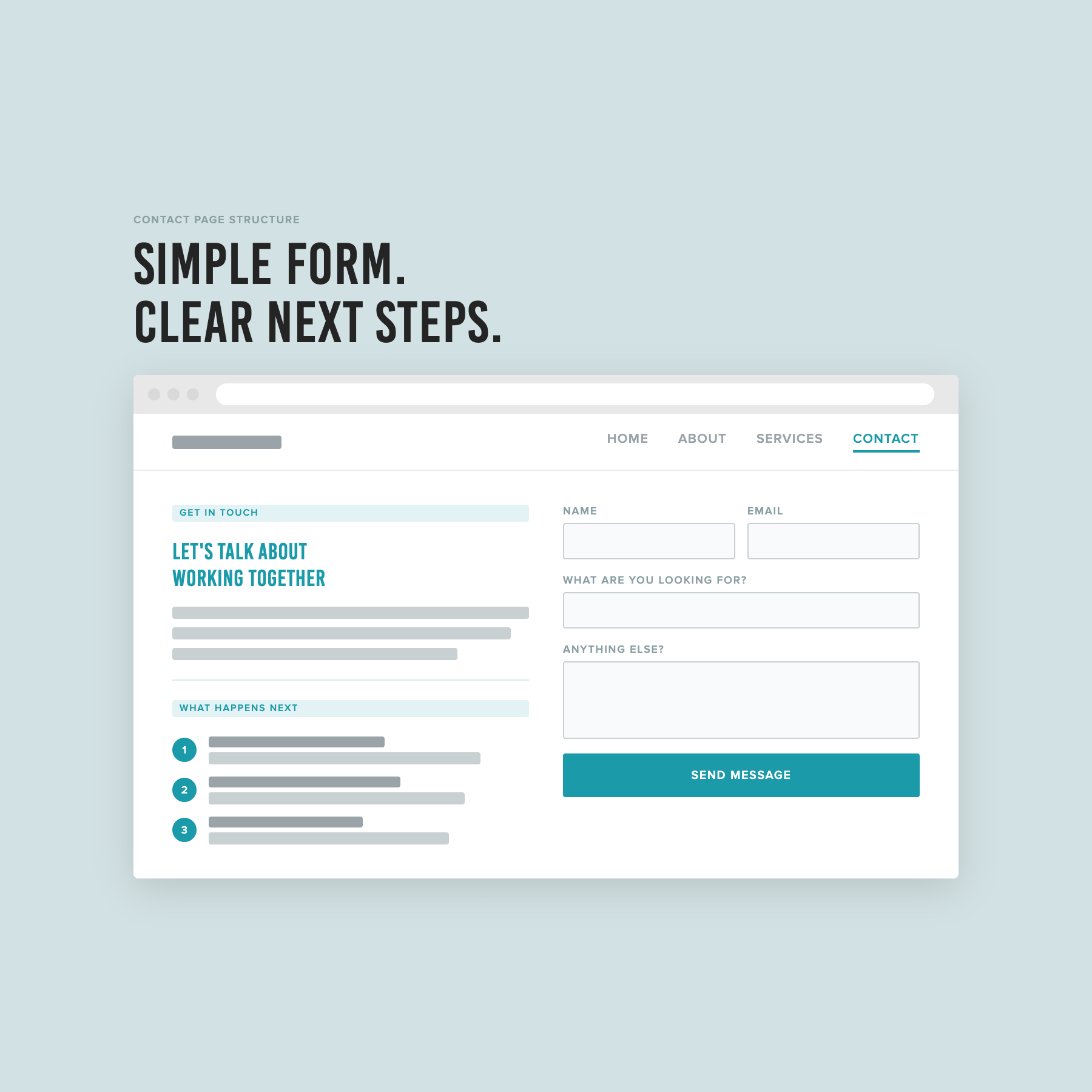
A short intro, a simple form, and a numbered breakdown of what happens after someone submits.
What to leave off your contact page
Multiple contact methods on the same page creates unnecessary confusion. An email address and a contact form and a booking link all sitting together means your visitor has to make a decision before they've even started the process of getting in touch. Pick one primary method that fits your process and make it the obvious next step.
Vague CTAs are another common issue. "Get in touch" and "send me a message" tell someone what to do but not why or what to expect. A small amount of context goes a long way. Something that indicates what this form is for and what will happen next makes someone far more likely to fill it in.
And as mentioned above: keep the form short. It can feel counterintuitive when there are things you genuinely need to know before a call. But the contact form is not the place to gather all of that. Its job is to convert an interested visitor into a lead. Everything else can come after.
The short version
Your contact page has one job: make it easy for the right person to take the next step. That means choosing a contact method that fits your process, keeping the form short enough that people actually fill it in, and being clear about what happens after they do.
If you want a step-by-step process for setting up your contact page alongside the rest of your site, that's exactly what The Capsule Template walks you through.
FAQs
Do I need a contact page on my website?
Yes. Even if you also list your email address elsewhere on your site, a dedicated contact page gives potential clients a clear place to go when they're ready to reach out. It also signals that you're open to enquiries, which matters more than it sounds.
Should my contact page have a booking link or a contact form?
It depends on your service and your clients. For most solo service providers offering higher-consideration packages, a contact form tends to work better because it feels like a lower-commitment first step. A direct booking link works well when the appointment itself is the low-commitment entry point; for example, a free discovery call, or a service people typically book without needing to ask questions first.
How many questions should I include on my contact form?
As few as possible. Name, email, and a brief description of what they're looking for is enough to open the conversation. If you need more qualifying information, send a separate form after initial contact. The longer the form, the fewer people will complete it.
What should I write on my contact page?
A short intro that acknowledges why they're there, clear information about what happens after they submit, and a simple form. That's it. You don't need a lot of copy on this page, you just need what's there to be clear and reassuring.
This post is part of a series on setting up your service business website. Read the full series: